Selected Work
Little Known Goods
UX / Design / Dev
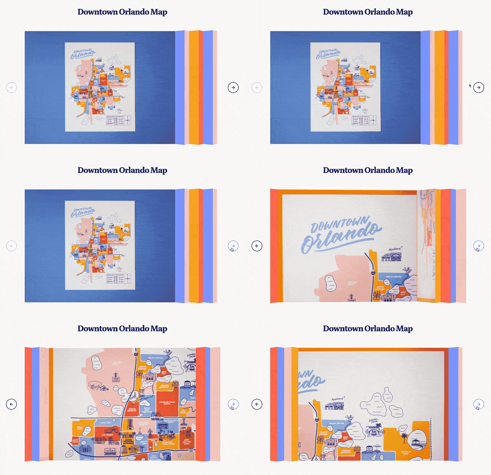
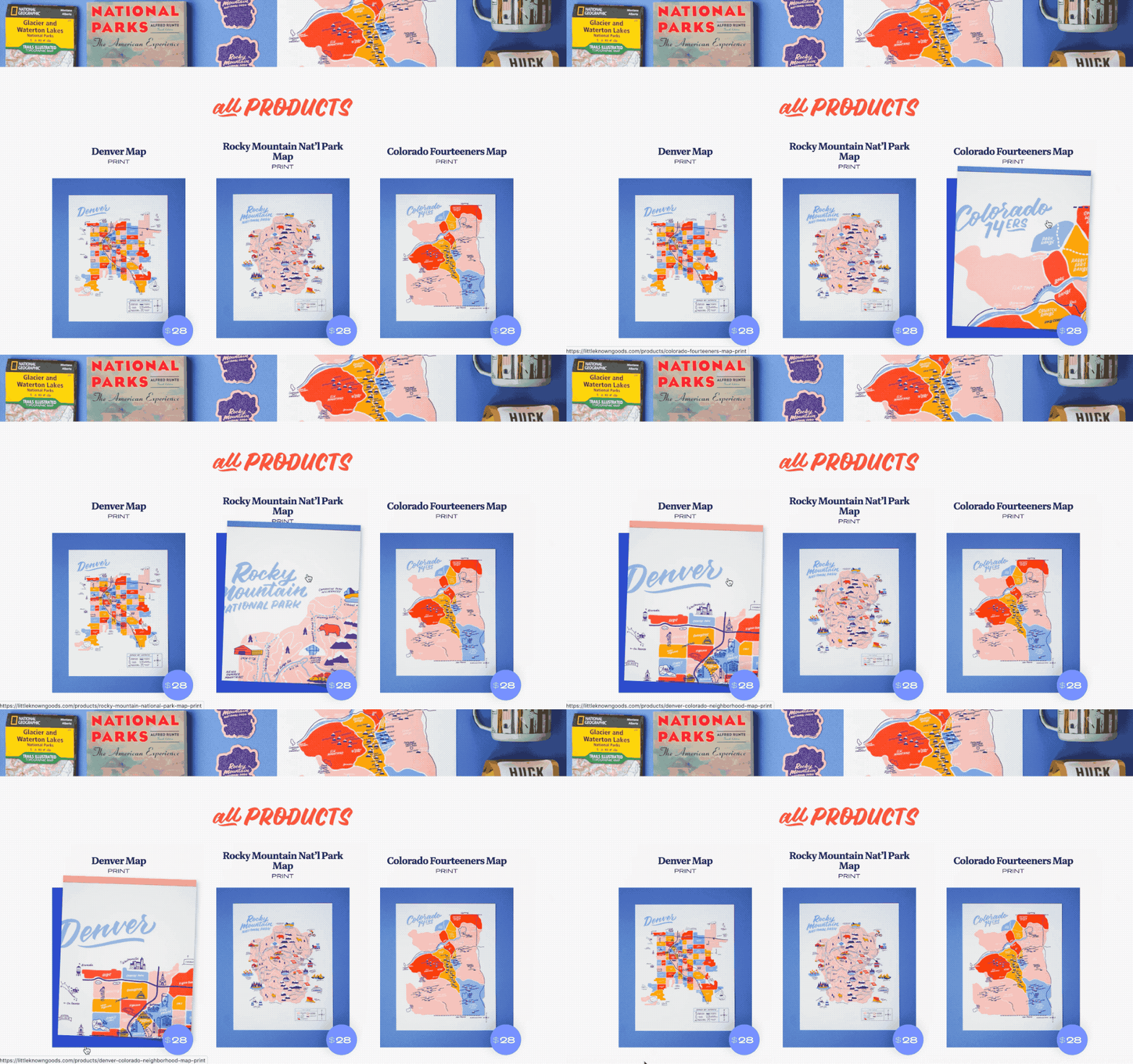
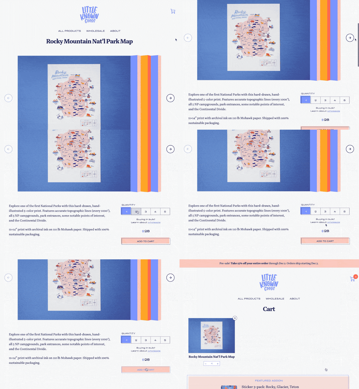
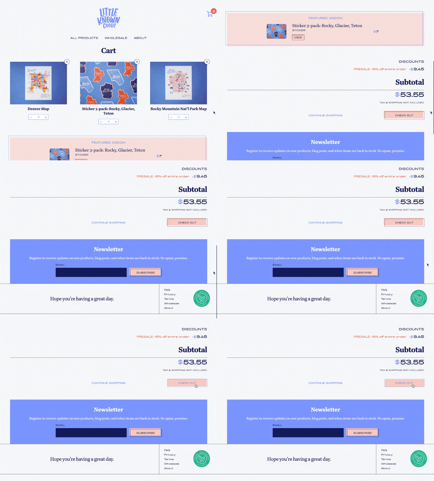
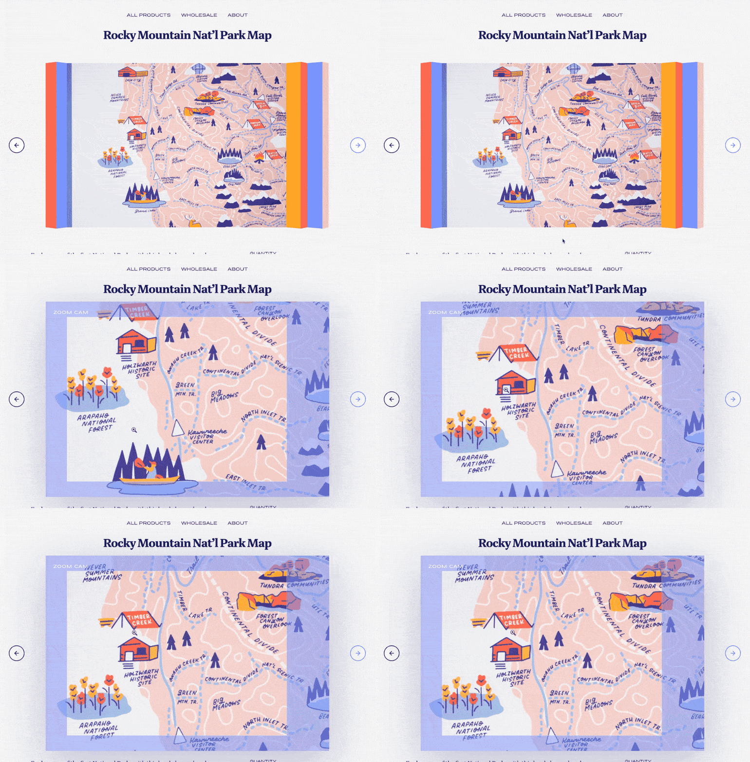
Little Known Goods is a maps, art prints, and goods company and a joint venture between Hillery Powers and myself. Being mostly an ecommerce site, there are special attention to details in unnoticeable places that have huge payoffs. First, carousels can be a point of frustration, especially if they lag or don’t behave as expected. And for the image previews on a print site, image quality is everything. The carousel progressively-loads larger images as bandwidth allows, and being almost pure CSS, animates performantly [2].
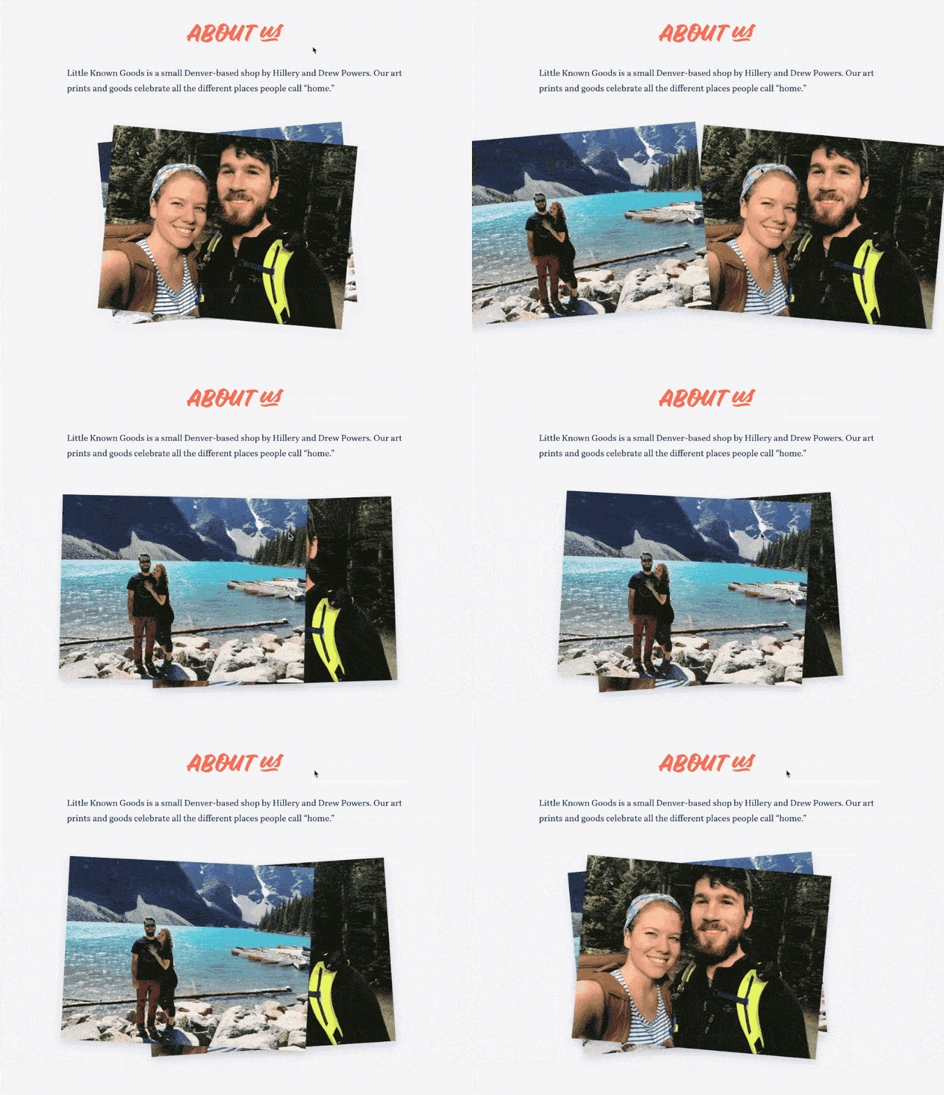
Other little areas of delight over the site are added, from unexpected card shuffles [1/5] to a click-free zoom [6]. This was also a return to form (at least for me), with the entire site being progressively-enhanced, framework-free, and works without JavaScript. Also, being my own client, I got to add a detail I’m rather proud of that few companies allow: the hidden UX of privacy. When shopping on the site, we don’t load analytics, and we do everything possible to minimize third-party data collection. Aside from the ethical part of it, tracking and analytics can really hinder UX with slow load times.
The site will be a work in progress for a while, but I’m still proud of its current state as a reminder you can never gloss over the basics. HTML and CSS are the backbone of the web, and you can still build a darn good site in 2019 by betting on both.
Manifold
Design / Dev
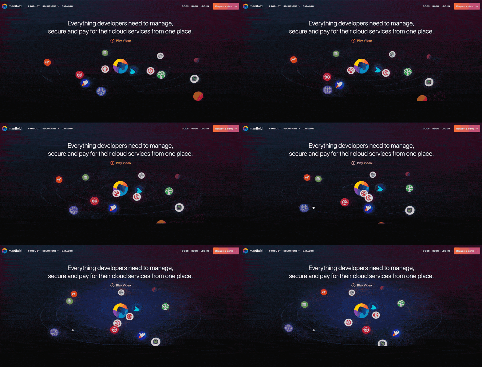
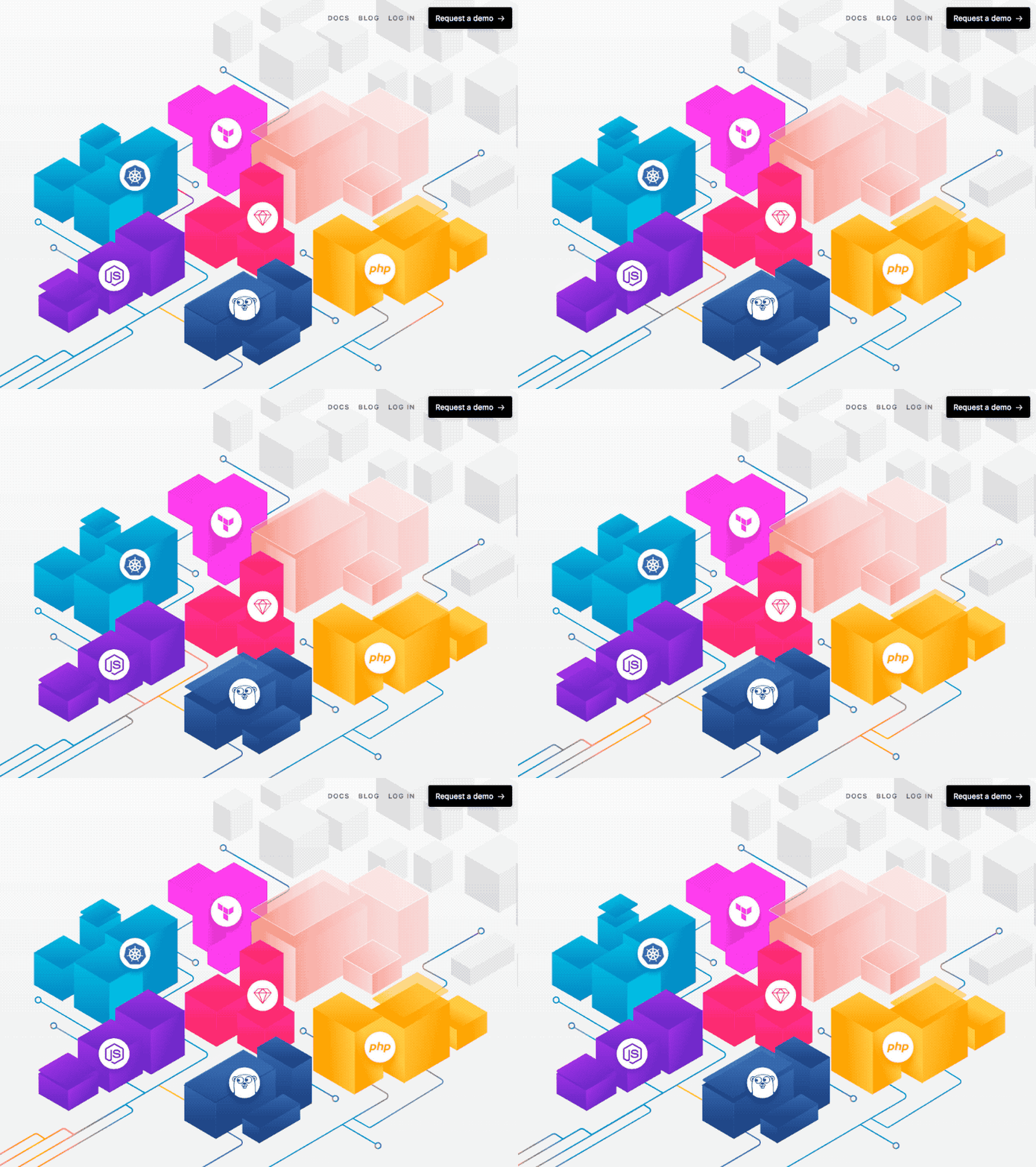
Manifold is creating a SaaS marketplace with Dashboards, APIs, and integration tools for any platform to launch their own SaaS marketplace with little time and effort. In a startup you wear many hats, and I had the privilege of leading the front-end engineering team, acted as Product Engineer, mentored, and was an Engineering People Manager for a stint. Mostly, my hats were merely a disguise to sneak in animations wherever I can [1/2/6].
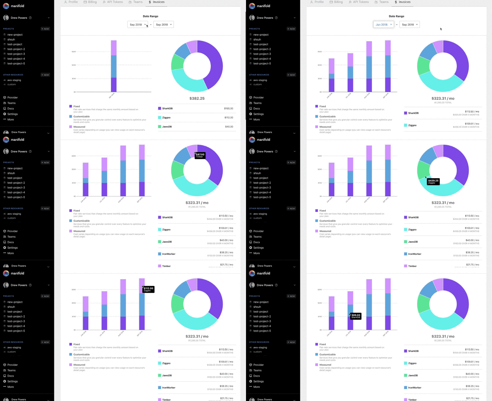
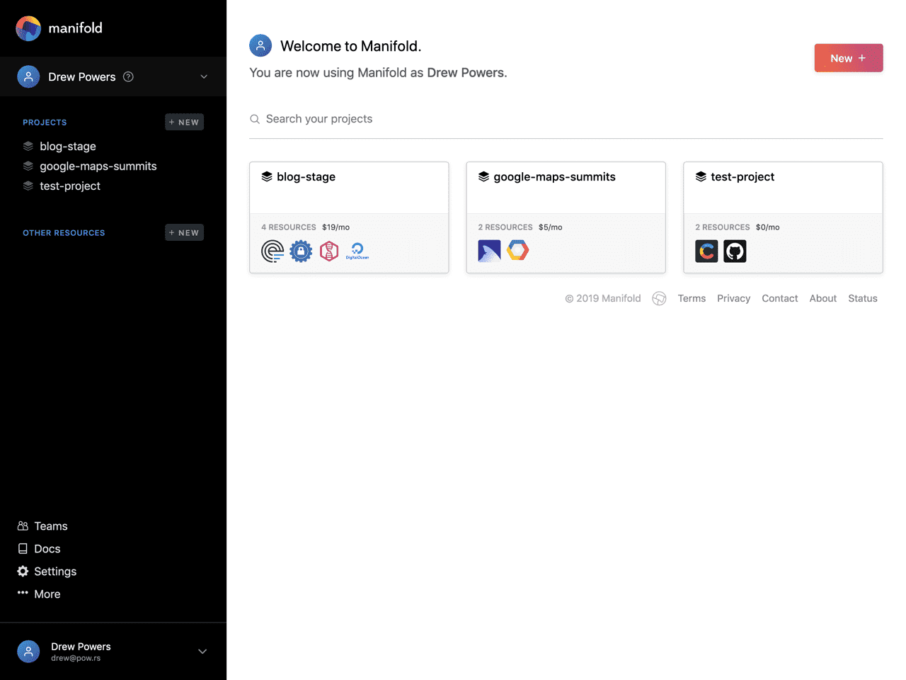
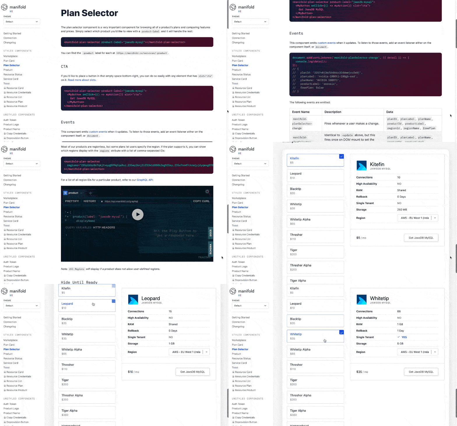
My journey started helping expand the Manifold Dashboard [4], building React interfaces for users to manage their services. As part of that, Nicole Tibaldi and I developed an interactive invoice breakdown using React + D3.js [3] (that sadly never got shipped). Other big projects included releasing a provider management console (pivoted / currently in-progress), various updates to marketing efforts, ongoing management / updates to Manifold’s web design system, and the biggest project I worked on: open-source, universal Web Component library (and docs). [5]
My open-source contributions grew here as well, where we open-sourced everything reasonable, like swagger-to-ts, graphql-gen, and react-scroll-agent. Manifold is a dreamy engineering culture that cares about empathy and diversity, and I’m lucky to still be a part of it.
Lineage Roasting
UX / Design / Dev
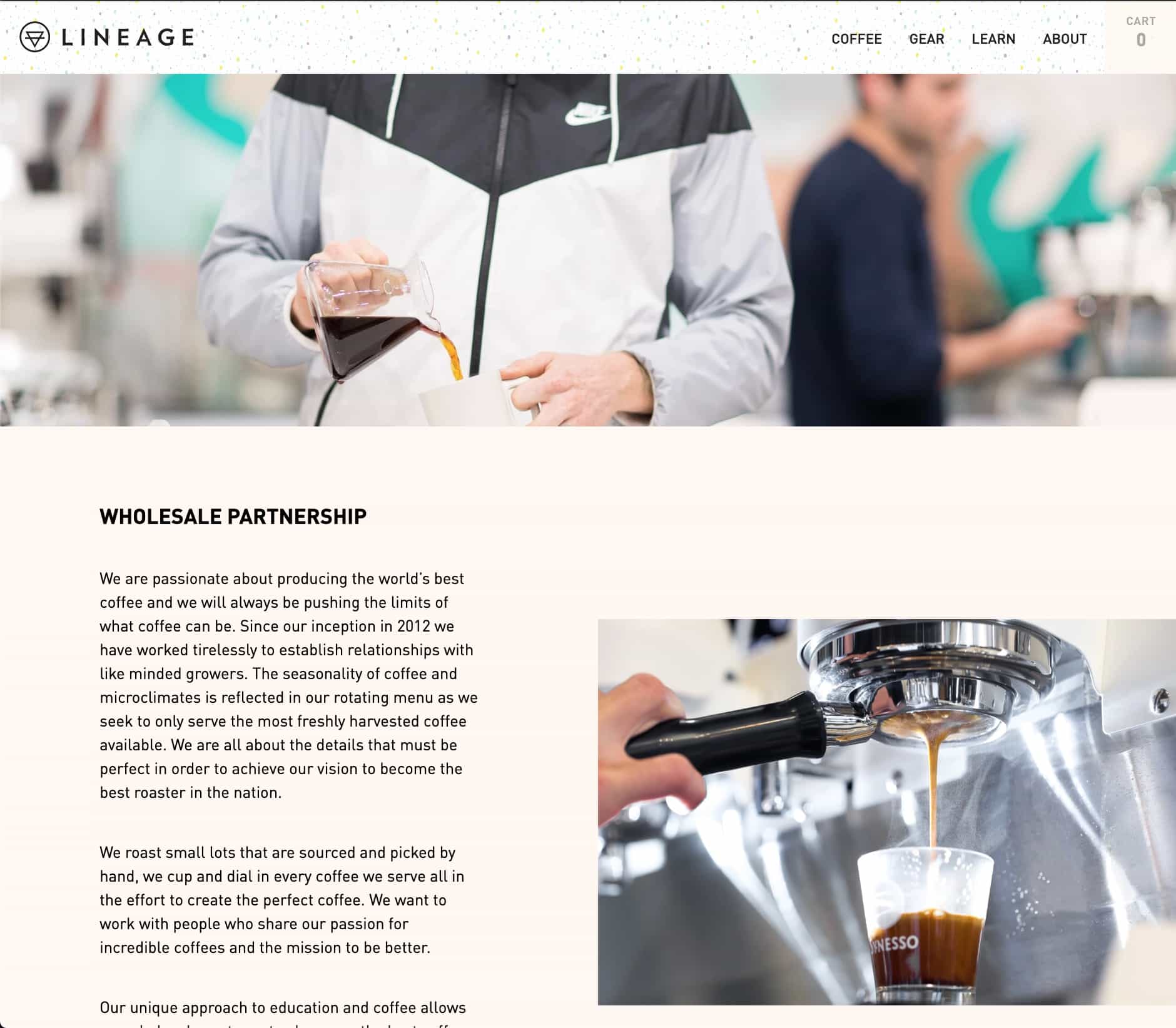
I can’t say enough about these lovely people that are changing the world with a roastery. The effort put into the quality, craft, and ethical practices to ensure every farmer they source from makes a fair living wage is inspiring. And others have taken notice, too—Lineage has won national roasting competitions and usually becomes everyone’s favorite roaster after discovering them. I met with Jarret & Justine Johnson, the founders, and Ryan Wilcox, co-partner, to design and develop their new site.
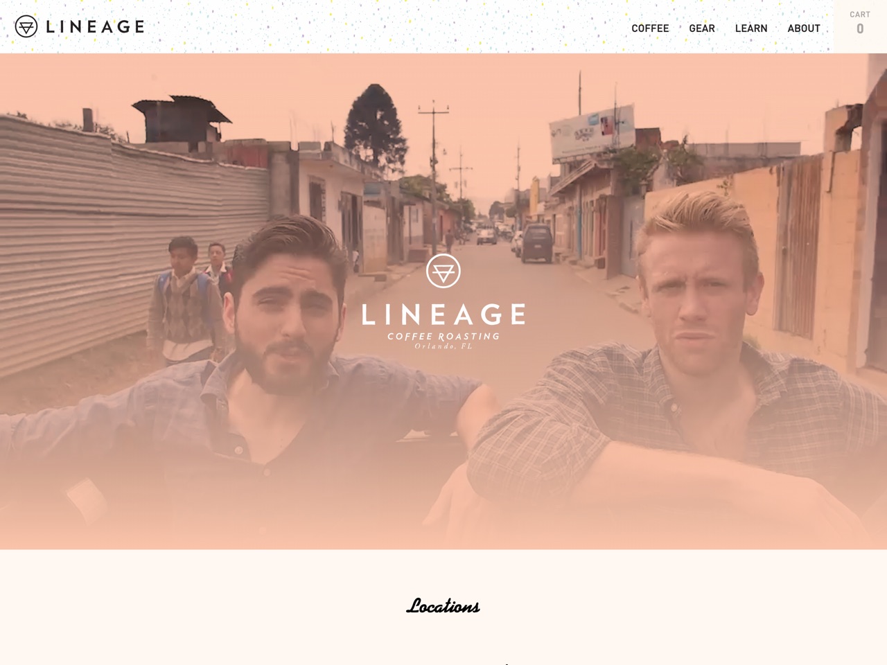
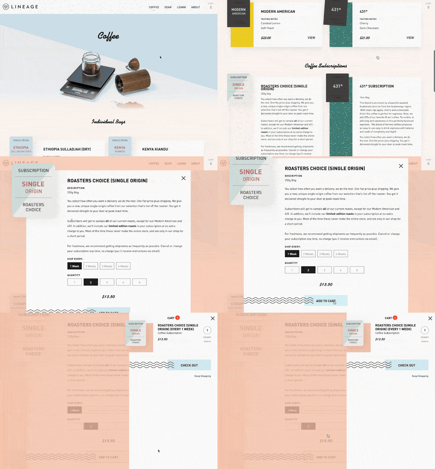
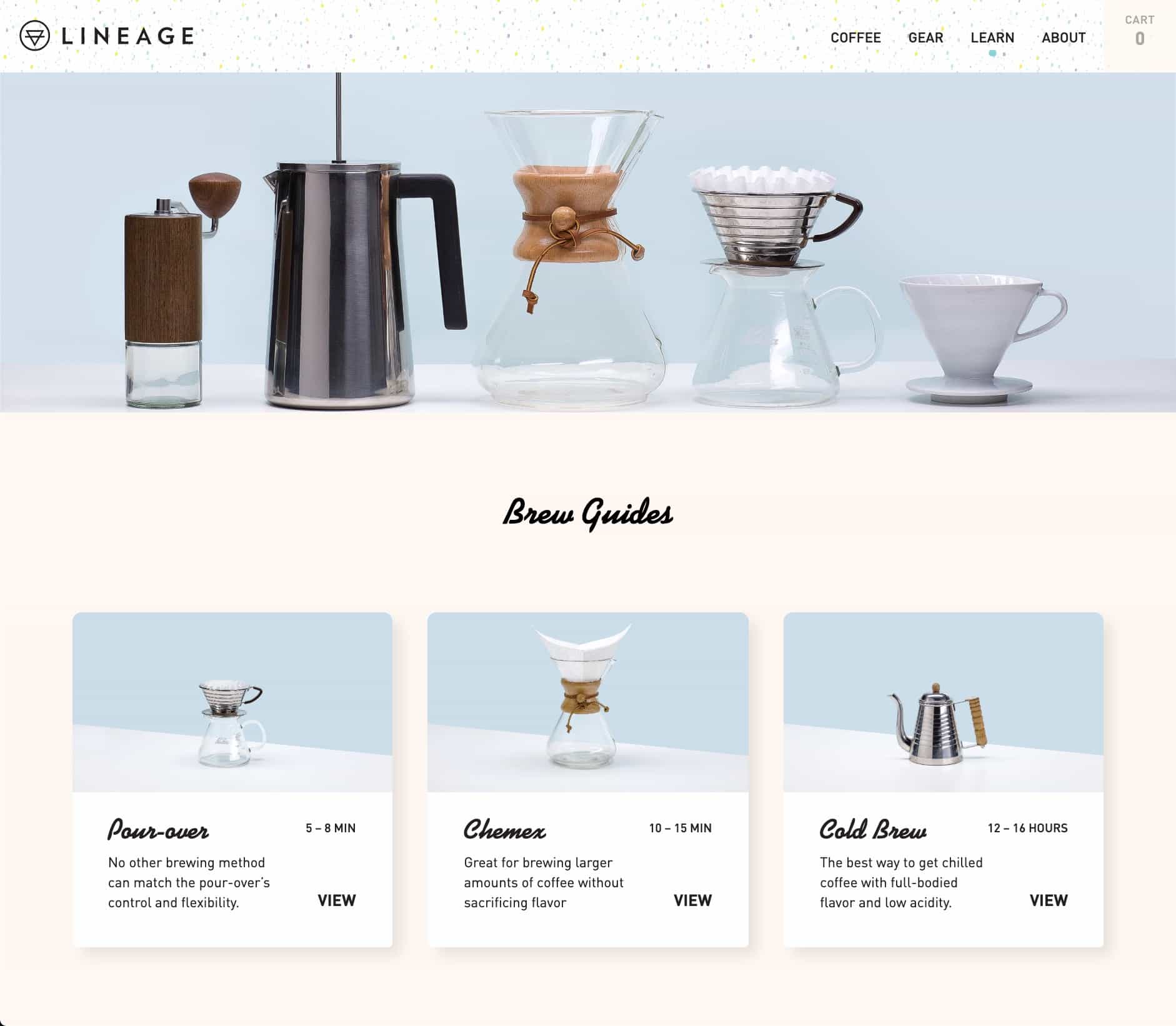
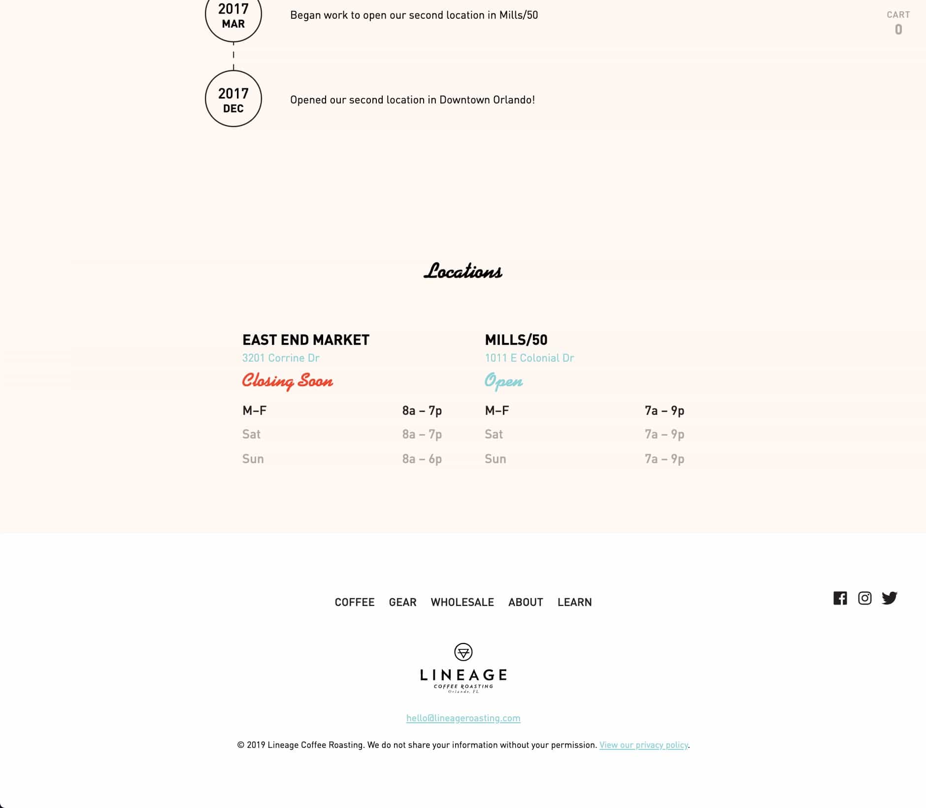
They had a big year ahead of them—opening a new store, expanding operations—and needed to look more presentable to business partnerships with updating branding, new photography done by the award-winning Dylon York [4/5], and a new online presence. Their wholesale customers—the backbone of their business—also needed better information online. So we set out to keep the core shopping experience but with a more on-brand look. That resulted in my editing a video for their homepage with footage they took from trips [1], and helping bring their new color system onto the site: (green for dark, rich coffees; yellow for fruity coffees, pink for floral coffees, etc.) [2]
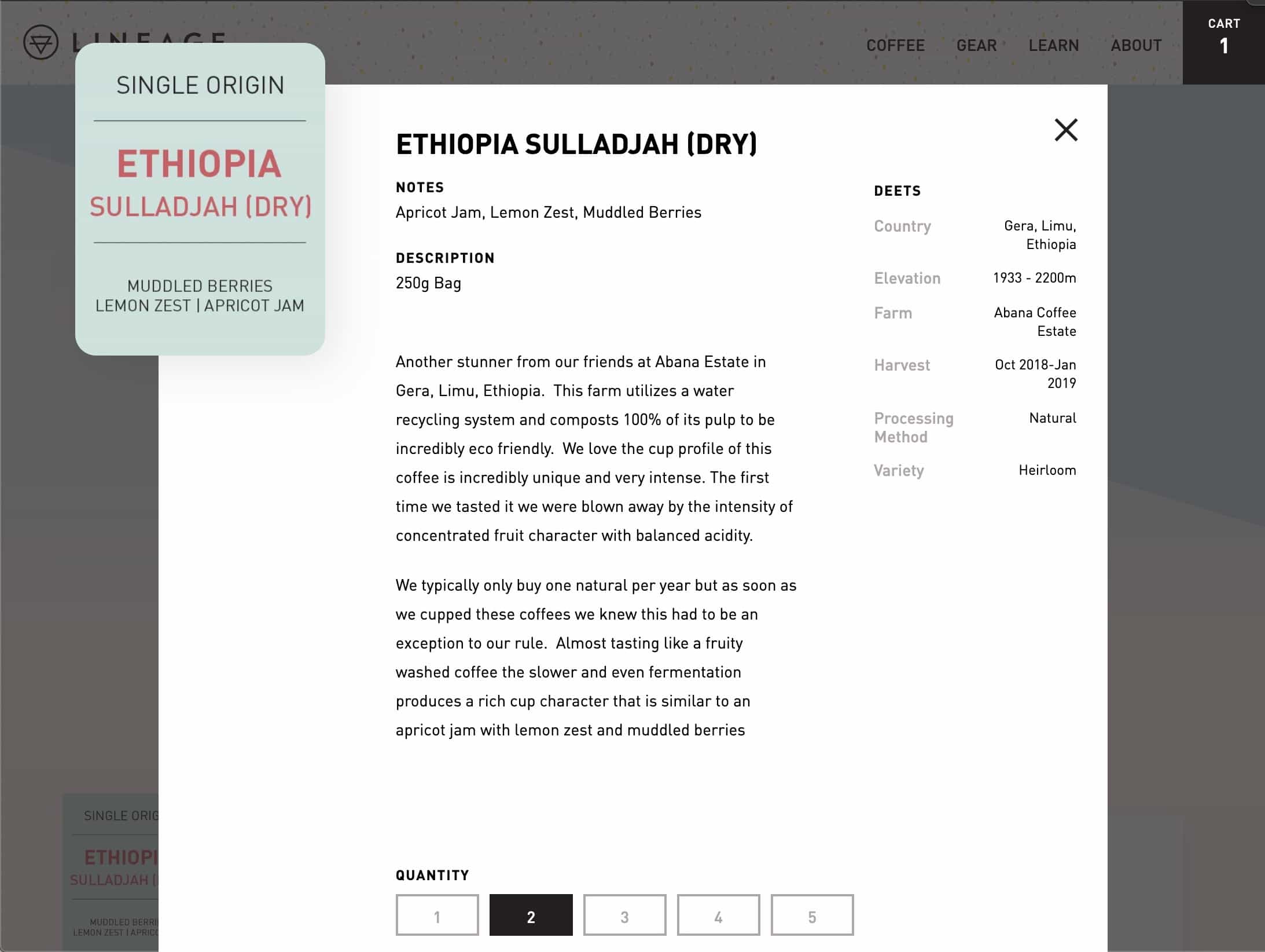
Also central to their pathos was having data for all their coffees, from elevation to origin to notes to sometime even the farmer’s name! [2] All of this is editable through their Shopify Dashboard. The site leveraged the then-brand-new Shopify GraphQL API, and using React & React Router it can navigate quickly and seamlessly after the initial load. As far as client projects go, this is easily one of my all-time favorites. And I couldn’t have worked with nicer, more talented people.
Mama’s Sauce
UX / Design / Dev
Who doesn’t love Mama? In 2015, Nick Sambrato contacted me with a better web vision for America’s favorite boutique spot printing company (according to an anecdotal poll). The
old WordPress blog wasn’t cutting it, especially for the sales team that arguably spent more time giving clients free letterpress masterclasses than they did actually booking jobs.
So after many, many conversations, we set out to build a better
mousetrap
quote form.
And I LOVE forms
(I’m not kidding).
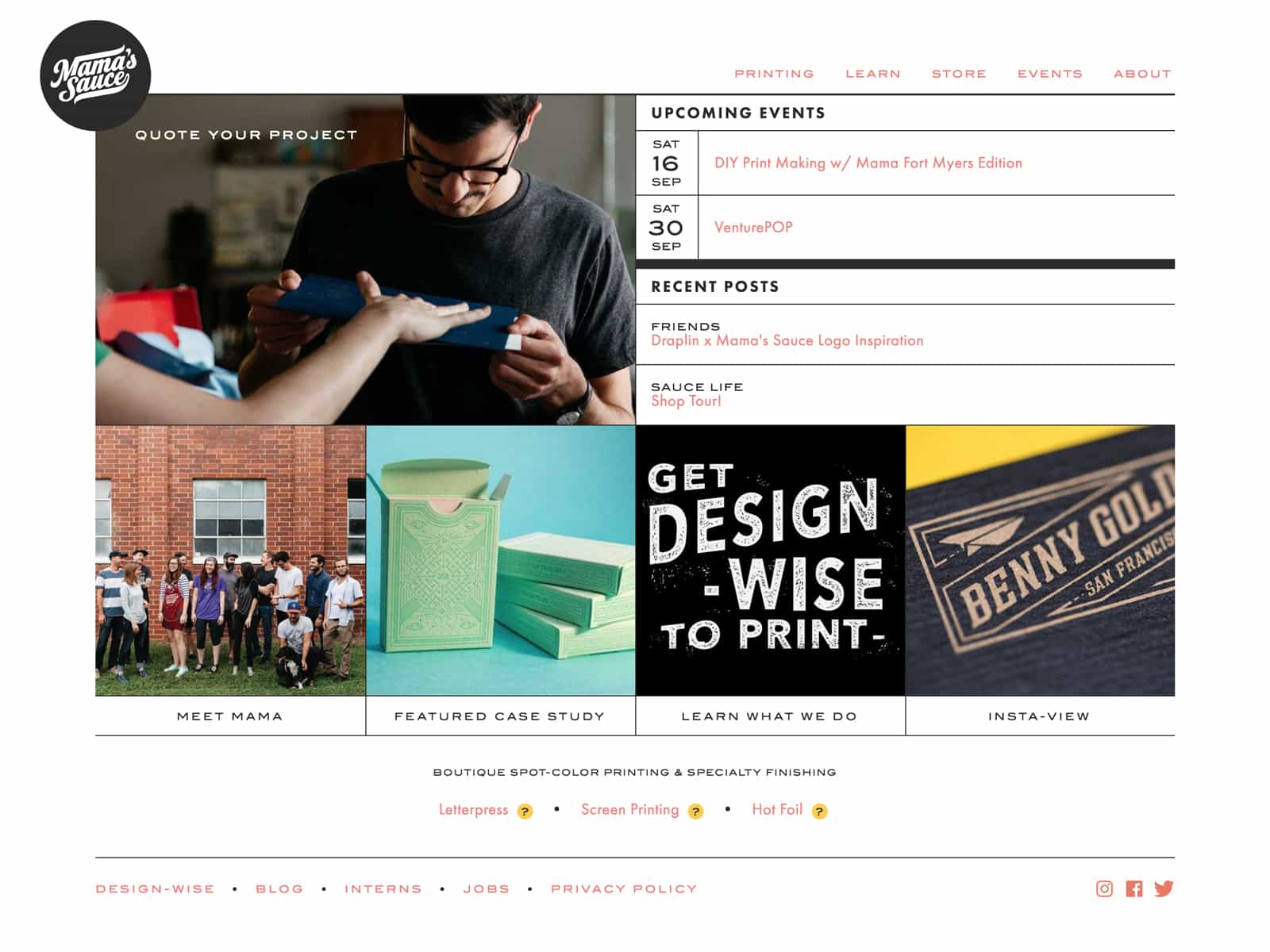
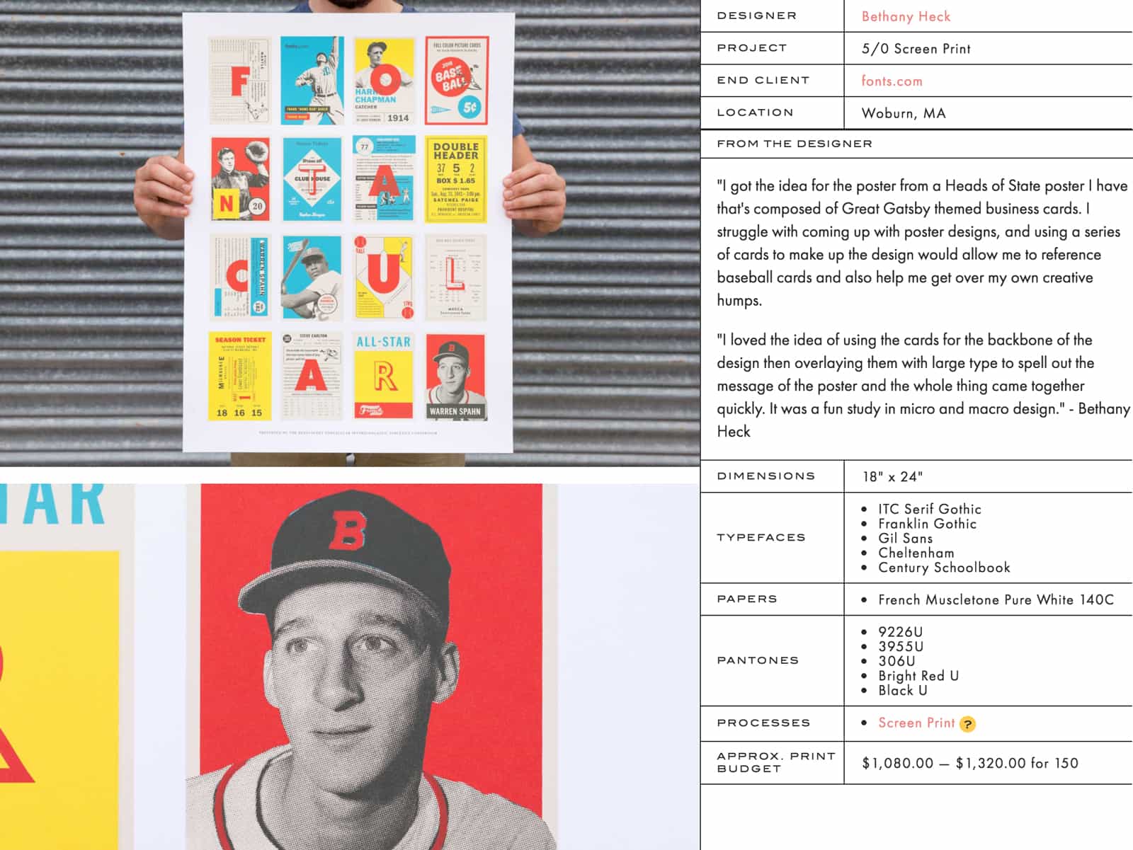
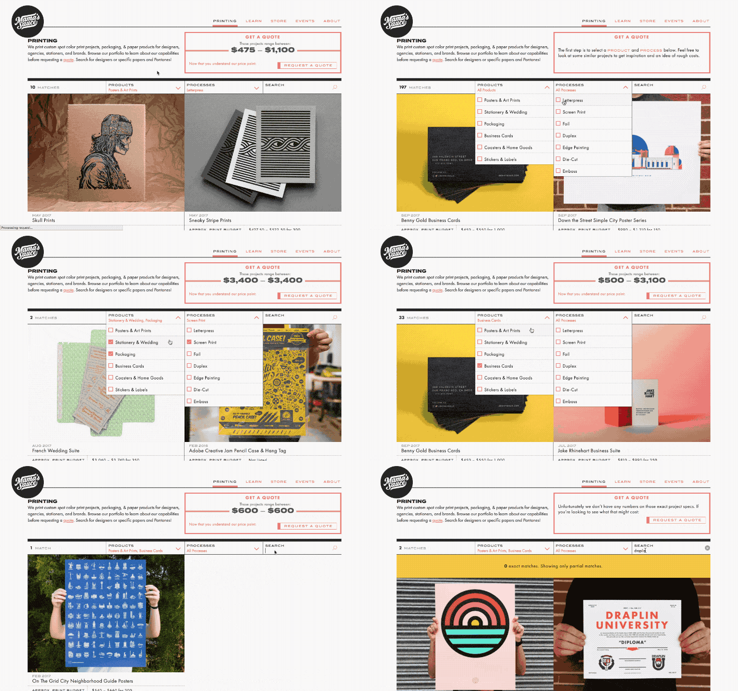
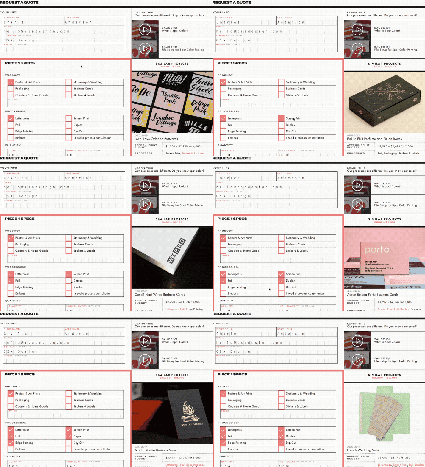
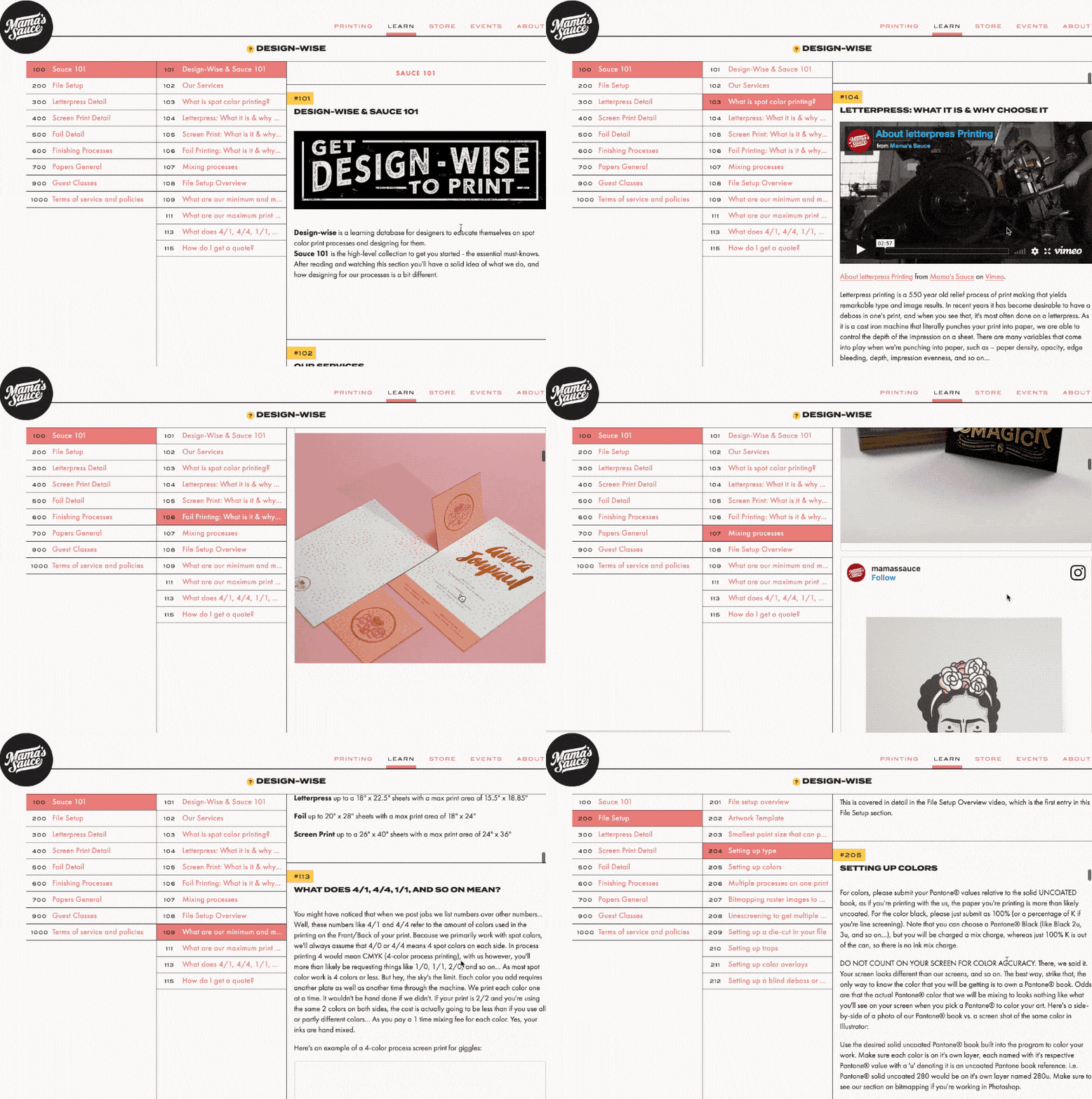
Every part of Mama’s complex process was boiled down into a three-part funnel. First, force clients to browse printing to see what spot printing looks like. Second, see estimated cost [3] (this weeded out a large number of non-clients). Third, ask serious clients very specific questions about their project in a detailed quote form [4] (I love forms. They’re my favorite). This process was a great gut-check for clients to tell if they’re ready to submit. If not, they are pointed to the Design-wise™ section [5], an online brain dump of pretty much everything their sales team had grown tired of repeating.
Visually, I pulled from early 20th century typographers and mid-century packaging to create a stripped-down, type-centric site that took a backseat to the vibrant photography [2] while subtly hinting at Mama’s top-notch precision. The result is a website that “gets out of the way” while you’re swept up by beautiful printing. In less artsy news, the site is a Ruby on Rails app with Vue.js front-end, custom CMS backend, and my family’s secret image optimization recipe for low data usage.
Real Thread
UX / Dev
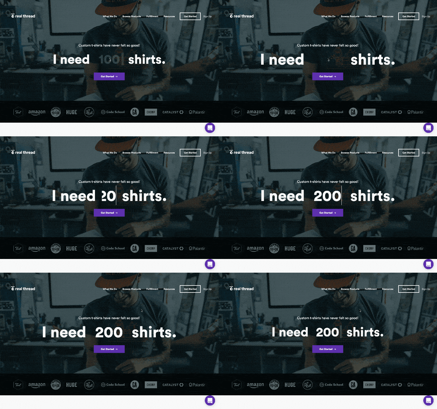
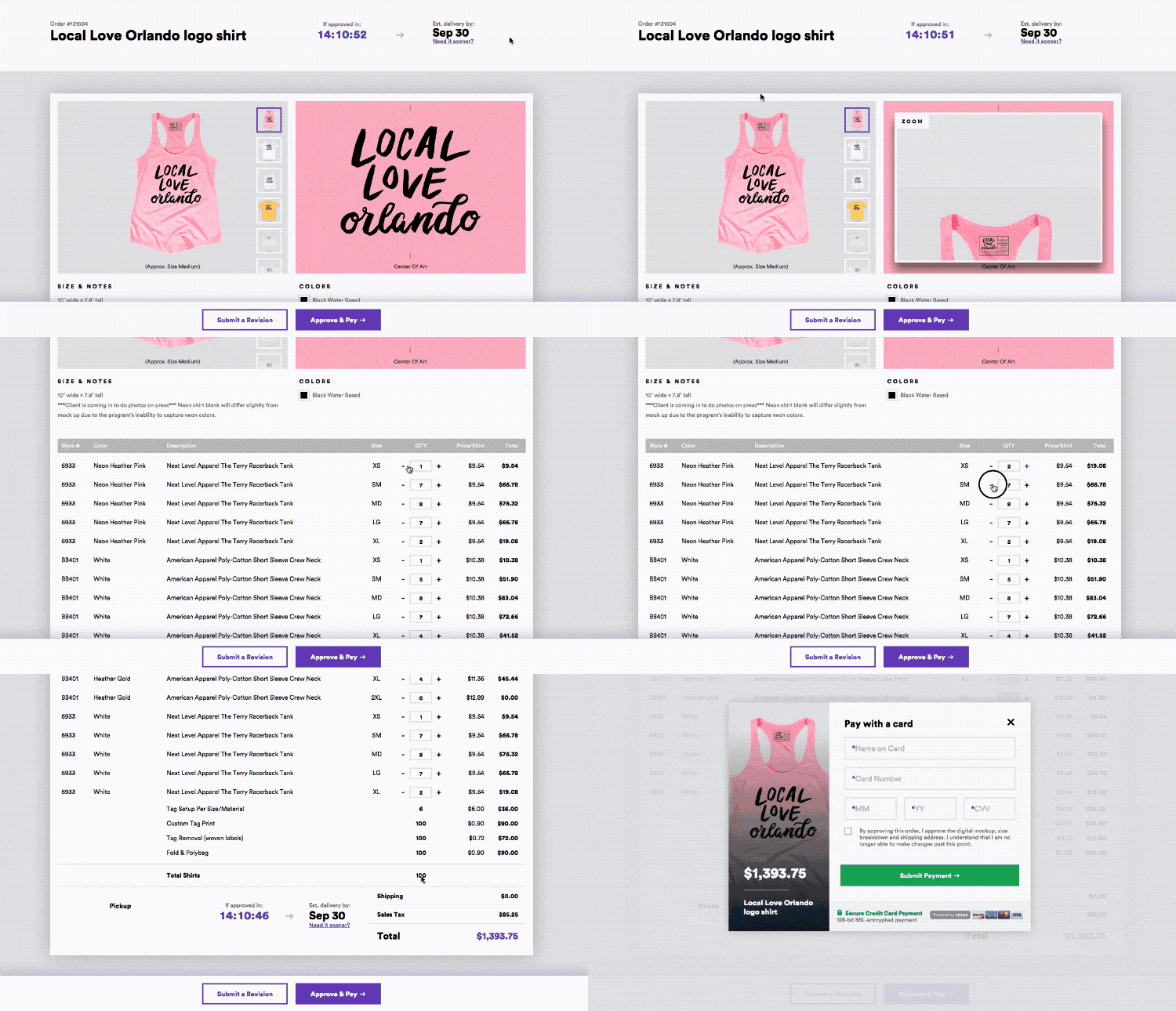
Real Thread reached out to Envy Labs in 2015 to alleviate some growing pains. When they approached us, their current quote form was nothing more than an email submit form that piled into a sizeable stack of potential orders. Employees sometimes took days to reply with an estimate and mocked-up artwork, at which point many clients moved on to a quicker printer. Assuming the client stuck around, the approval and revision process only exacerbated and dragged out each order, resulting in a slow and frustrating process on both ends.
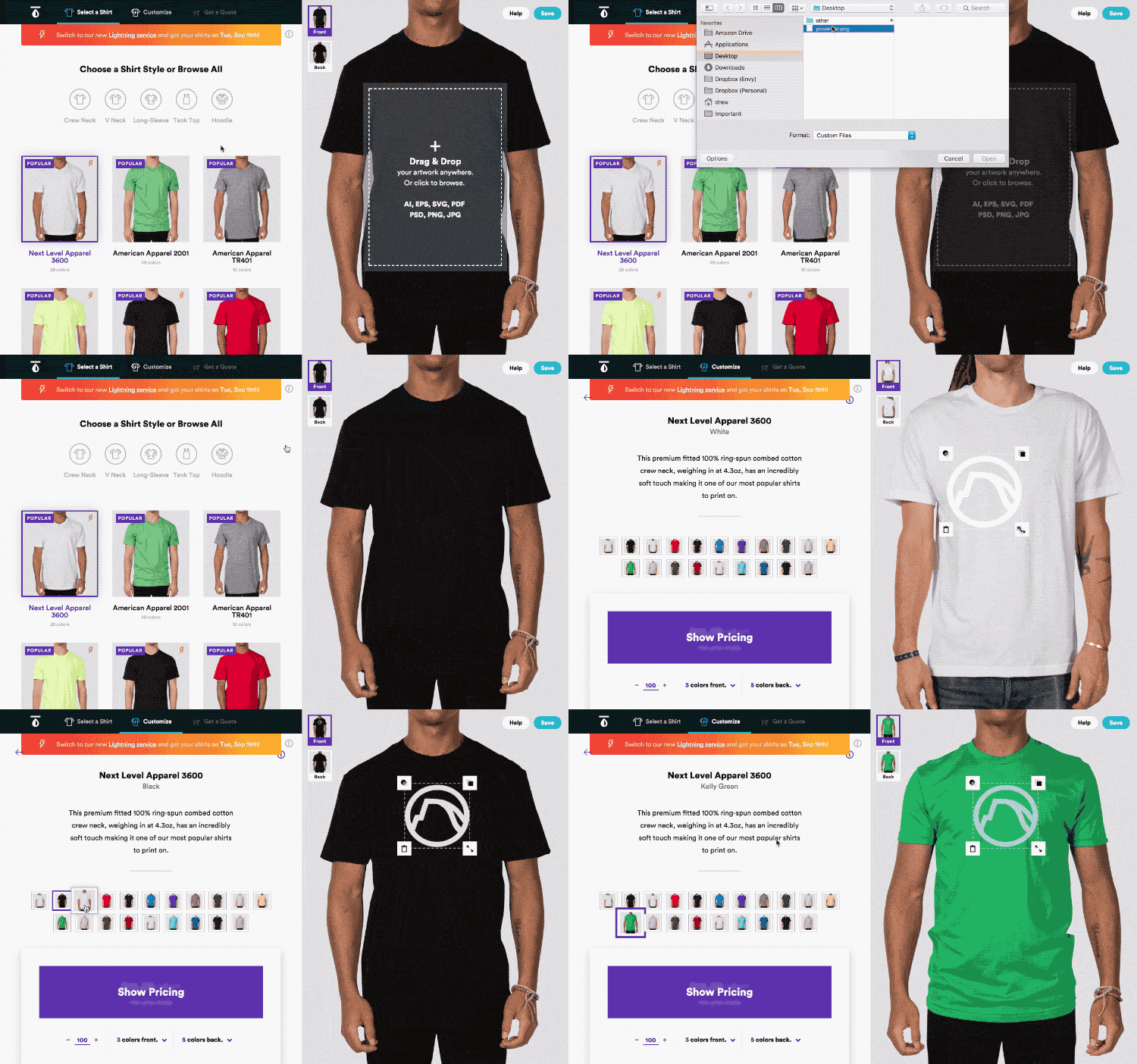
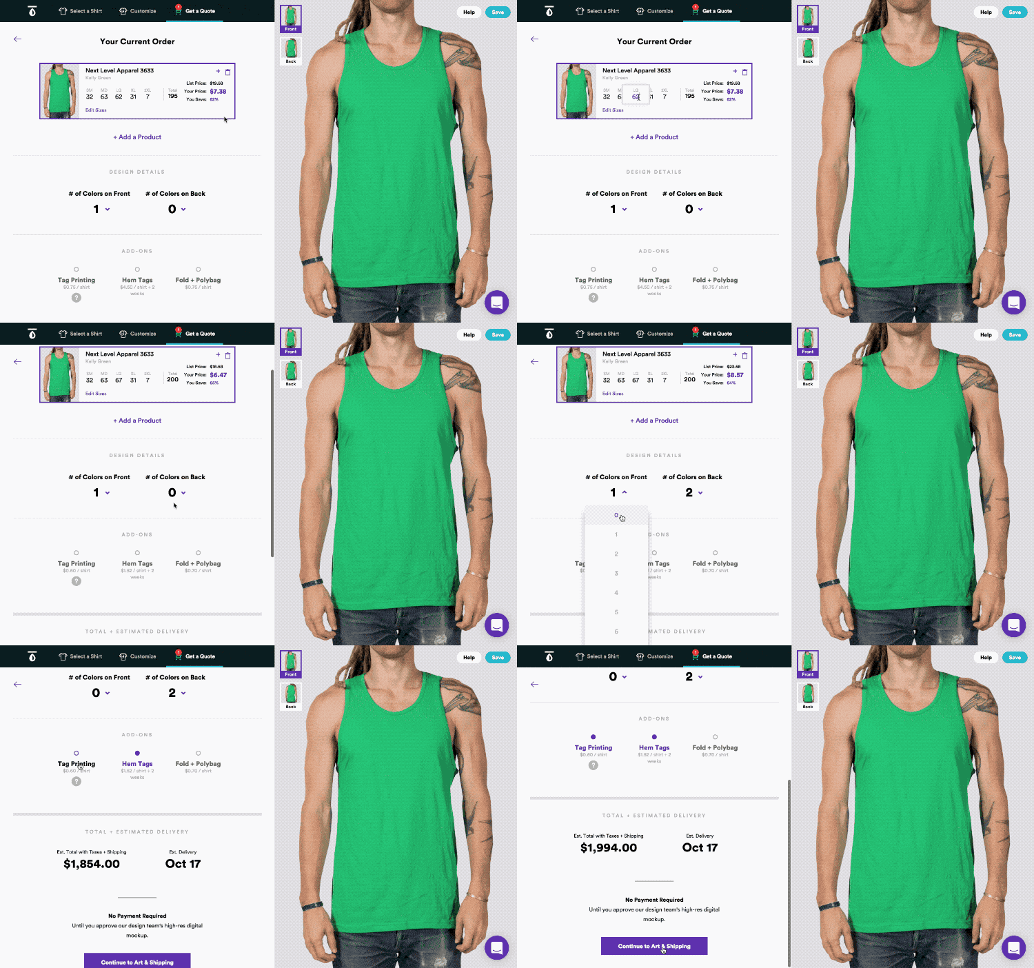
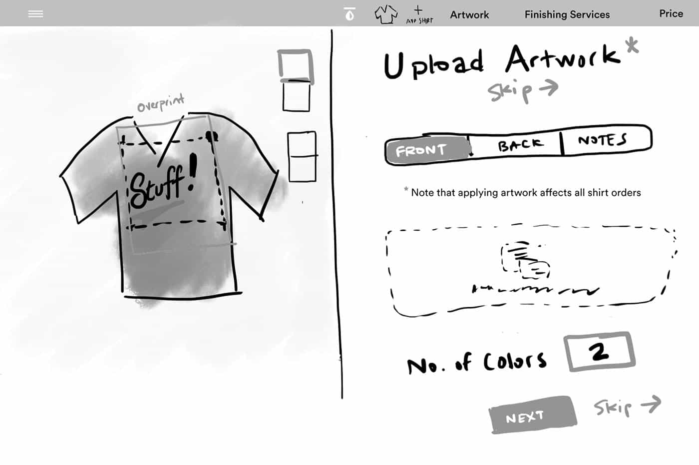
After many in-person meetings (local clients are great for that), we examined the entire customer shopping experience of getting shirts printed, from different personas ranging from novice “family gathering tee” client to professional designer client, making sure the psychology and priorites of their key demos were met. The result was a pretty slick automated quote generator [3] powered by Salesforce. Drew Smith (freelancer) handled the major design and art direction for the project, while I provided UX consultation [4] and lead front-end development on the project.
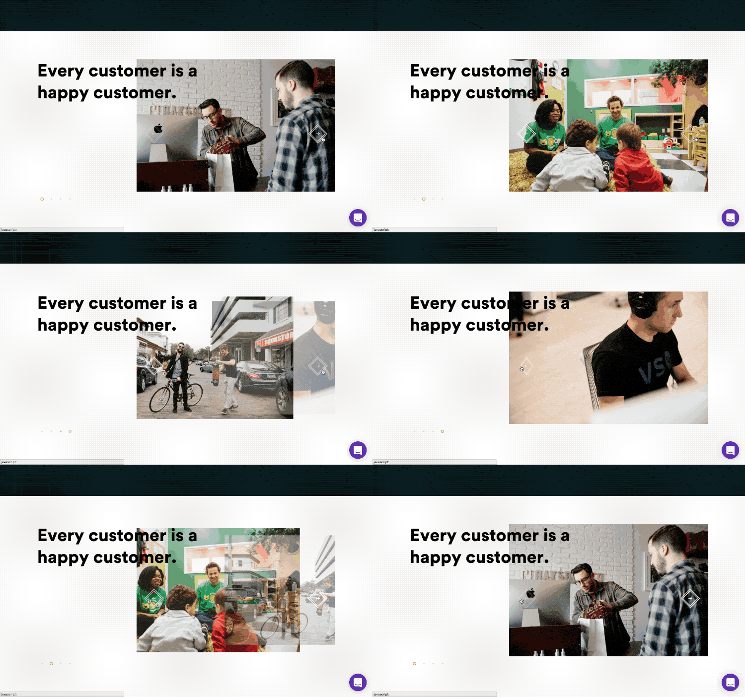
Customers could now not only get an instant quote—boosting Real Thread into a new online retail level—but thanks to integrating with Salesforce, customers could manage their order through the whole process, and Real Thread’s backoffice had visibility into everything [5]. Thanks to Angular and front-end performance optimization, the new site performed faster than their old one by a longshot. The project, completed over 4 months, doubled Real Thread’s customer throughput with no work/staff changes on their part, and dramatically improved customer satisfaction.