web design isn’t becoming more boring, and isn’t losing its soul

Web design is boring. Web design is losing its “soul.” Web design is becoming less creative.
No it isn’t.
I’ve heard these types of comments from both developers and designers, makers and spectators alike. And a large portion of the community seems to agree. But I want to set the record straight, and qualify these thoughts a little bit:
Brochure web design is becoming more boring.Not web design in general. That’s a subtle but important distinction.
What is “Brochure design?”
Brochure web design, sometimes called a pamphlet website, is a website that exists to showcase a business or product. And brochure sites only make up a small portion of the Internet. You can actually design other types of sites, such as journals like Nautilus, web apps like Facebook, reference sites like Wikipedia, review sites like The Wirecutter, etc. Brochure sites are one of the most versatile types, though, because they serve needs for many businesses, from local restaurants to building contractors to startup products, and everything in between. They’re a digital business cards—an interactive brochure that has all the important information about a business in one central, navigable place.
A brochure website is graded on one rubric: wayfinding —the design discipline of helping people find where to go. In a broader sense, wayfinding design can be physical or digital, including road signs, mall maps, website navigation, etc. Good wayfinding on a restaurant site helps you find the menu and hours quickly. On a building contractor site it directs you to services and how to get a quote. On a software product site it swings by features and pricing structure before the signup button. In all cases it presents the pertinent information up front while providing a few side options to cover different needs.

Often print/ad designers’ first foray into web design, brochure site design is actually quite different from advertising. Ad & marketing design seeks to grab your attention amidst a sea of competing designs: a gig poster plastered on a pole littered with other gig posters, or a magazine cover in the center of a magazine isle of the grocery store. Ads can be loud or quiet—whatever environment they’re in, they seek to disrupt with uniqueness. By contrast, brochure site design is a site a user has chosen to visit already, so there is no need to disrupt. There is no immediate competition, as this site takes up an entire browser tab. Its primary job, then, is helping users navigate to the information sought. Brochure site design seeks predictability over disruption every time.
Criticizing brochure design for being boring is like criticizing road signs for being boring. Road signs need more pizzazz! you say. Why don’t road signs try to be different and unique? you ask.
Because they’re road signs.
They’re boring for the drivers’ benefit—if every road sign was different there’d be a whole lot of attention devoted to the signs and a lot less on steering that 2-ton metal missile on the highway.
Designer Needs vs User Needs

Sure—the commonality of a horizontal top nav with a full-bleed hero graphic is more than you can shake a stick at. It’s been beat to death, frankly. There’s no arguing that.
But it’s too simplistic to wave off a common pattern as “bad.” It’s more than a pattern, it’s a paradigm, an established method of solving a problem. The horizontal nav limits choice—reducing cognitive load—and maximizes screen space. The hero graphic narrows user focus, and delivers a quick elevator pitch that immediately helps the user determine if this is the right site or not.
But even more than that—it puts the user’s needs first. It casts aside your designer ego to do something different, and instead delivers a common, established method of communication that’s so effective even Apple is doing it (3rd row, 3rd column above).
Making a good brochure website for a business or product is like trying to make an inanimate help desk answer every user question thrown at it without anyone actually being there.
That’s hard. And it’s wrong to place the burden of cutting-edge design on a profit-oriented, user-first problem solving mission.
Outside the brochure
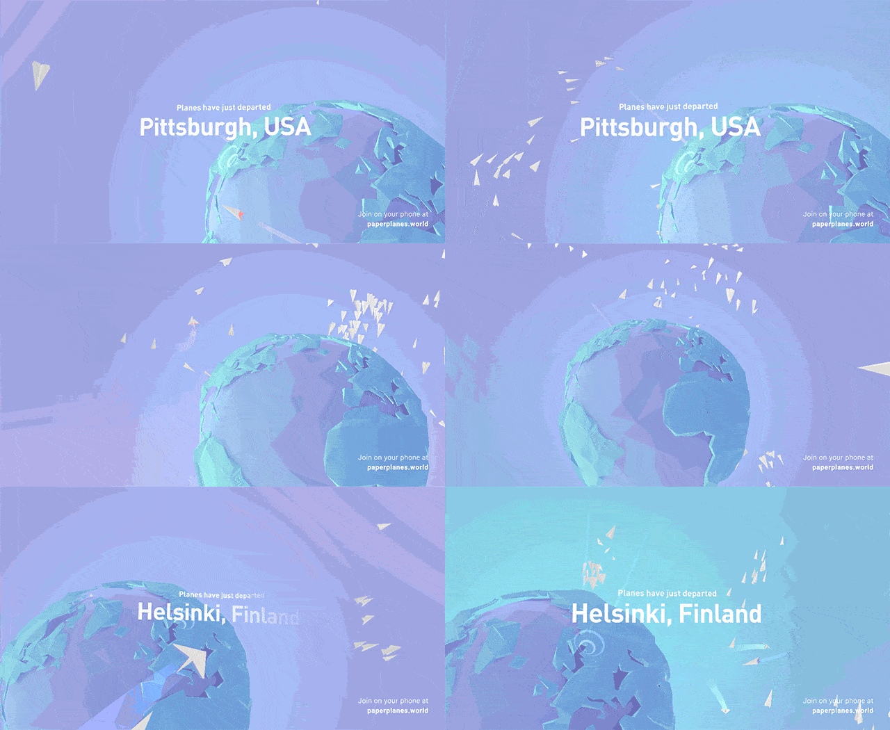
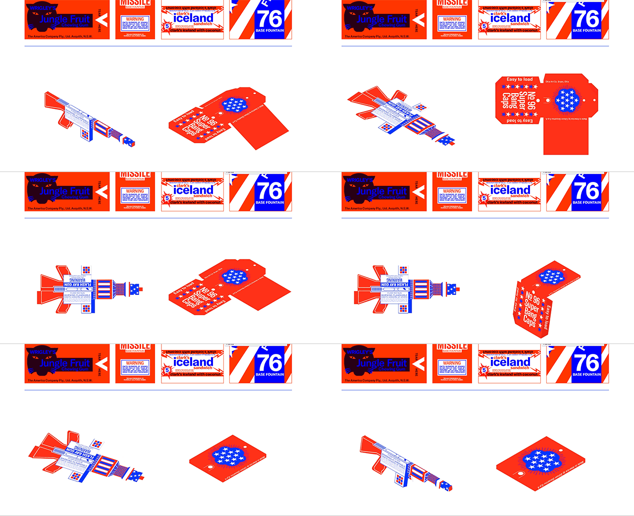
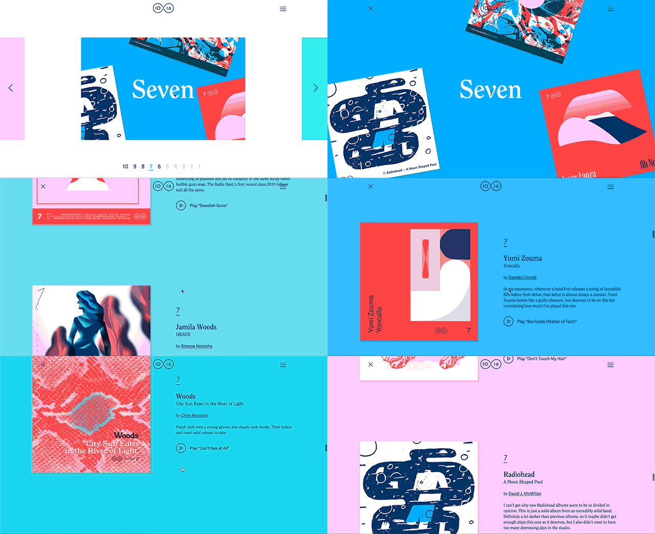
Meanwhile, while people are complaining about how boring brochure sites are—which should be more about user needs anyway—the rest of web designers are too busy creating awesome shit like …

… and

… and also

The New York Times is killing it with interactive data visualization. Filmmakers are making interactive short films. Artists are creating new interactive artforms constantly.
I’m not sure what Internet you’ve been browsing, but there’s a lot of insanely imaginative stuff popping up all over the place.
Summary
I mean no disrespect to the designers and developers that have made comments like “the web is boring” before. I’ve made those same comments myself. And I like to think that critical comments of this nature, at their core, are just us expressing our frustration with laziness. Hopefully, these critiques stem from a desire to not only make new things ourselves, but push the envelope on design as a whole. But I’d like to offer a simple reminder: it’s not always about us.
Just as there’s “a time to tear and a time to mend,” there are times where we put the users’ needs first (the “muggles”), and that involves **placing information in predictable places for them to find**. It’s not glamorous, but it is kind. And there will always be other opportunities for us to push the envelope outside of that, when users aren’t depending on us and we’re simply creating for creation’s sake.The time for invention on brochure sites may be long gone, or at least progressing at a slower rate than we’d like. But there are even more exciting, new experiences ahead—far greater than any of us may have dreamed. It’s only getting better, and there’s never been a more exciting time to be a part of it all.
读中文 ?網頁設計沒有變得更無趣,也沒有失去靈魂 (
_ translated this article into Traditional Chinese, which you can read here)_